5
The Haas Typefoundry Ltd. in an International Environment
Changes and Developments in its Organisation and Operation
5.1
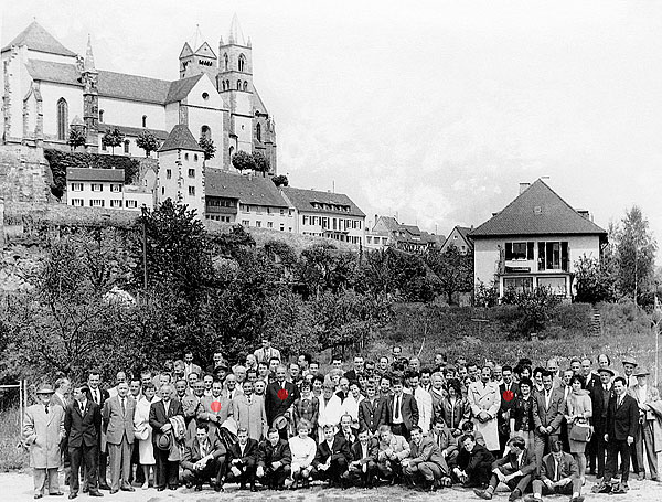
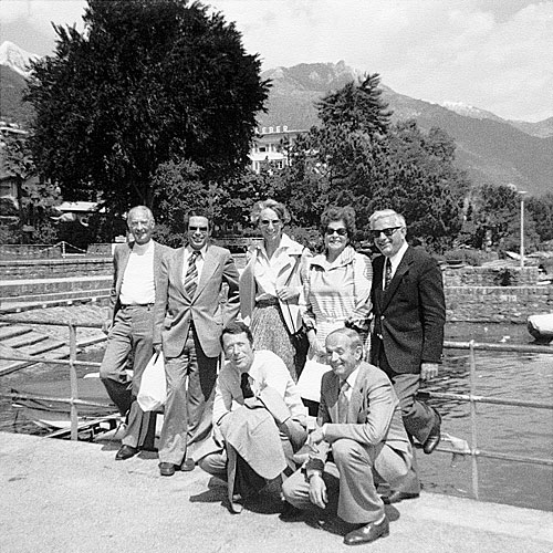
Company trip to Neubreisach to celebrate Eduard Hoffmann’s 70th birthday, May 1962.
● Pictured from left to right: Walter Fisch, Eduard Hoffmann, Alfred Hoffmann
Introduction
Haas was the most famous Swiss typefoundry and also the “world’s oldest typefoundry” 1 operating for more than 400 years, including continuous activity from 1740 to 1989. 2 Several persons played an important role during its later existence. Formerly owned by the printing and typefounding family Genath, with Johann Rudolf Genath’s death in 1740, Johann Wilhelm Haas (1698–1764) became the new owner. A punchcutter and typefounder from Nuremberg, he came to Basel in 1718, where he worked with Genath before becoming part of the foundry’s family, marrying his boss’s niece. Johann Wilhelm Haas was able to establish a good working environment that his son and grandson could build on. 3 His son Wilhelm Haas Sr. (1741–1800), and his grandson, Wilhelm Haas Jr. (1766–1838), were active in creating successful innovations in type and printing technology. Wilhelm Haas Sr. released 110 typefaces, established new international relations, increased the company’s staff by hiring 19 assistants, introduced new elements and improvements, invented a typographic measurement system and a way of setting typography on maps with lead type. He also improved the printing press by replacing the press’s wood with metal. Wilhelm Haas Jr. built on what his father had set up, with improved typesetting on maps, the new printing press, expanded business relationships through international trips, establishing a book printing office and a xylographic department. He ran an art publishing house and was active as an officer and city councillor. 4 When Wilhelm Haas Jr. died in 1838, the company was doing very well. In 1852, his sons sold the company. A time of ups and downs followed, but the company survived.
As the title of Willi Mengel’s article suggests: ‘Die älteste Schriftgießerei der Welt’, in Linotype‑Post (Berlin & Frankfurt/Main: Linotype GmbH), 34 (March 1957), pp. 6–9.
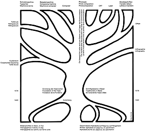
1740 was the year when Johann Wilhelm Haas took over the company, which had existed under different names since 1579.
Mengel, pp. 6–9; see also Albert Bruckner, Schweizer Stempelschneider und Schriftgiesser (Geschichte des Stempelschnittes und Schriftgusses in Basel und der übrigen Schweiz von ihren Anfängen bis zur Gegenwart), im Auftrag der Haas’schen Schriftgiesserei AG (Münchenstein, 1943), pp. 66–84
Mengel, pp. 6–9; see also Bruckner, pp. 84–129; see also Martin Kluge; Basler Papiermühle, Die Basler Papiermühle: schweizerisches Museum für Papier, Schrift und Druck (Basel: Basler Papiermühle, 2014), pp. 75–8
In the twentieth century, Eduard Hoffmann 5.2 (1892–1980) was a leading figure in the company, which he joined in 1917. He worked with enthusiasm into the new fields of typography and type. In 1937, he became co-director with his uncle, Max Krayer, who had initially hired him. 5 5.3
Under Krayer the logo representing a rabbit was designed by F.W. Kleukens, a German type designer.
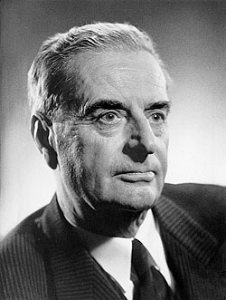
5.2
Eduard Hoffmann at age of 70, 1962

5.3
Haas logotype, F.W. Kleukens, 1927
Following his uncle’s death in 1944, he led the company until his retirement in 1965. His son Alfred Hoffmann, 5.4 born in 1927, also became involved. After an internship at Haas, he went to New York, where he worked for a quality printing office from 1949 to 1951. In 1951 he returned to Basel to help his father, becoming vice director in 1959 and director in 1968. He was responsible for the sale and marketing of foundry type. He also took care of worldwide typeface licensing. As a member of the board of ATypI (Association Typographique Internationale), founded in 1957, he was involved in corresponding with its members and was the Honorary treasurer for 30 years. Besides that, he helped organising several ATypI 5.5 congresses, mainly the two in Basel (1980 and 1986). His language skills, being fluent in English and French, were of great advantage. He retired in 1989, following the closing of the foundry. 6
Victor Malsy; Axel Langer; Indra Kupferschmid; Helvetica Forever. Geschichte einer Schrift (Baden/Switzerland: Lars Müller, 2008), p. 23; Alfred Hoffmann, Interviews and Conversations (17, 31 January 2015; 6 June 2015; 5, 21, 23 September 2015)
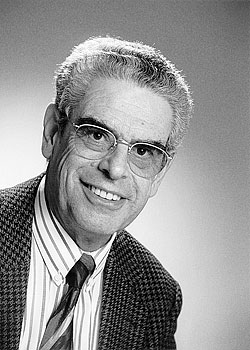
5.4
Alfred Hoffmann at age of 72, 1999
5.5
Front row from left: Adrian Frutiger, Nicolete Gray; back Rudolf Hostettler and unknown participants, ATypI working seminar in 1979 at the premises of the Haas Typefoundry
Apart from these main players and decision makers, many other people contributed to Haas’ success: Martin Fehle in particular, who joined the factory as an external expert to ensure success in all areas. He had a running Trust agency and consulted in financial and licensing questions once a week for almost 30 years. 7 He was also the authoritative delegate of the board. Although they are not mentioned by name, without its employees, Haas would not have been what it was. By the time the foundry closed, the company numbered about 35 employees. In the boom period of the nineteen sixties, when human labour was still in high demand due to the technologies in use, there were about 120.
Martin Fehle (1925–2008) was a former President of ATypI. He was a long-standing member of the Board for Lindt & Sprüngli chocolate company in his home town Kilchberg/Zurich (Switzerland). Luc Devroye, Martin Fehle, Type Design Information Compiled and Maintained by Luc Devroye <http://luc.devroye.org/fonts-48782.html> [accessed 5 June 2015]; Hoffmann, Alfred
In this paper I will discuss the Swiss Haas Typefoundry in the context of the various needs of labour, business operations and organisational structures, mainly from the beginning of the twentieth century up to its closure at the end of the century. I will study its business development in the light of its organisational background in a period of transition due to technological changes. Then, I will take a closer look at its activities, such as typeface design and production, and the business areas indirectly related to type. My findings are marked by the foundry’s involvement in the international market, which was responsible for its success.
Organisational Background in a Period of Transition
due to Technological Changes
At the beginning of the twentieth century, under Max Krayer’s direction, Haas had to face organisational changes in order for the company to survive. In the twenties, the German competition was strong, because their prices were considerably cheaper. Amongst the competitors were for example Stempel, Berthold or the Schelter & Giesecke typefoundries. A further issue facing Krayer was economic problems due to the new plant 5.6 in Münchenstein/Basel, which had cost more than twice as much as expected, as a result of building difficulties. The accumulation of several factors made the management join up with colleagues from the field instead of working against them; in 1927 the Haas Typefoundry was transformed into an incorporated (Ltd.) company. 8 From then on the foundries Stempel in Frankfurt am Main, and Berthold in Berlin, held 45 % shares each and were accordingly co‑owners. In 1954, Stempel bought from Berthold their Haas’ shares to have a 51 % majority. Stempel’s majority of shares, in turn, was held by Linotype. 9

5.6
The Haas Typefoundry Ltd., Münchenstein, in the sixties
Hoffmann, Alfred
Malsy et al, p. 25
While being part of an incorporated company was important for Haas’ economic stability, it also came with drawbacks. Occasionally it proved difficult to arrive at an agreement within the shareholders; those being in the majority sometimes claimed exclusive rights. An example is Linotype dictating on Haas’ Helvetica licences. Unlike other manufacturers, Linotype insisted on exclusive user’s rights for typefaces. Thus, they refused Haas the right to license Helvetica to any of Linotype’s competitors, without compensating Haas for this considerable loss of income. Whoever wanted Helvetica on a typesetting machine had to contact Linotype, whose aim was to sell more machines. The situation finally changed in the eighties when Linotype realised that licensing typefaces might be a new and welcome source of income. This could explain why Linotype — all of a sudden — hastened to buy up the foundries Stempel in 1985 and Haas four years later. 10
Hoffmann, Alfred
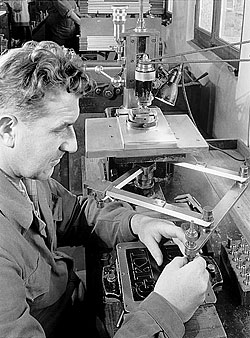
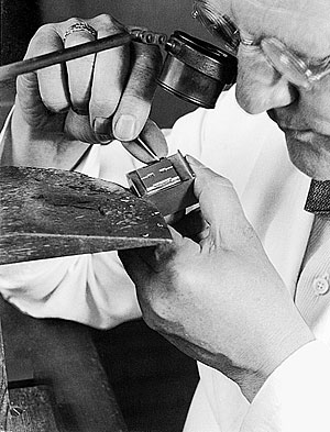
Foundry type in lead, 5.7 existing since Gutenberg’s times, was produced further towards the end of the twentieth century. In order to cast a typeface in metal, a matrix 5.8 for each and every letter was requested. This included the full alphabet with capital and lower case letters and all their accented letters for foreign languages, numerals and punctuation marks, altogether some 120 matrices per size. These were produced in the punchcutting department by skilled craftsmen. The time spent could easily take an average of four hours per matrix.
Taking some 13 sizes for just one only series as for instance Helvetica regular (in 6, 7, 8, 9, 12, 14, 16, 20, 24, 28, 36, 48 pt), the foundry ended up with some 1,500 matrices. Therefore, for all the Helvetica series from light to bold and their italics, extended, condensed and outline versions the number of 19 series was reached; multiplied by 1,500 makes 28,500, the total number of matrices needed to cast 5.9 all 19 series of the Helvetica family in 13 sizes each. 11
5.7
Brass pattern, engraved by hand, for the subsequent engraving of matrices by the pantographic method. typeface: Clarendon Bold
5.8
“Drilling” (engraving) of the matrix using a pantographic engraver.

5.9
Type founder and automatic typecaster, 1955
Ibid.
From the late sixties onward, the growing influence of the metal typesetting machines (Linotype, Monotype, etc.), as well as the advent of phototypesetting processes, caused manual typesetting to slowly lose its importance. Some traditional typefoundries shut down their operations. Haas acted swiftly, and bought them up (including Grafisk Compagni in Copenhagen, 1969; Deberny & Peignot in Paris, 1972; Olive in Marseille, 1978). The two French foundries possessed a remarkable selection of very popular typefaces, such as Univers, Méridien, Mistral, Antique Olive, Vendôme, Banco, Choc, Diane, and Peignot. These were still worthwhile to cast and sell. Later, when Stempel in Frankfurt am Main had to close down in 1985, Haas got the opportunity to cast lead type from their huge programme, too. The additional royalties coming in with this new collection of typefaces were certainly a welcome financial support in this period of decline for the profession. Following these acquisitions, Alfred Hoffmann undertook several trips to the French foundries’ former customers in Northern Africa, Ivory Coast, and Senegal. 12
Ibid.
Although the first phototypesetting machine came out in 1950, it took a while before the technology was fully established. The abandonment of lead was happening gradually and took decades. Lead had established itself in a strong and lasting way; it was reliable. The trust in the old system and the initial technological difficulties and non-reliability of the phototypesetting method made the phototypesetting technology grow very slowly, needing years of research to be completely refined. 13 An example of the kind of issues printers were confronted with during this transitional period, is reflected in the opinion of the owner of a local type shop. He claimed that Berthold had good machines, but that they were prone to interruptions. So, the acquisition of two identical machines was necessary to be able to work and deliver on-time — if one machine broke, the workflow could continue, thanks to the second machine.
See also Fritz Antenen; Fritz Jaggi; Kirschgarten‑Druckerei, Typorama. Rund um das graphische Gewerbe (Basel: Kirschgarten‑Druckerei AG, cop. 1964), p. 149
However, printers could not carry all of the newly emerging machines, because this would have been too much of an investment. At the time the so-called typesetting shops were established, 14 which were well equipped with all sorts of phototypesetting machines, typefaces, and also the human operators — all things printers could not afford in the abundance needed. Hence, printers outsourced part of their printing commissions, with the disadvantage that this service was costly. 15
Translation from German: Layoutsetzerei/en
Hoffmann, Alfred
In 1989, when Haas was officially closed, Linotype — holding the majority of shares — automatically acquired all the rights to the typefaces, whereby the traditional type casting department was ceded to the successor company Walter Fruttiger AG, located in Darmstadt. 16
The way Haas was organised, and the way it had to adapt to technological changes, built the basis for the various activities taking place at the typefoundry.
Malsy et al, p. 23; Walter Fruttiger’s lead type is still available at schriftenservice-d-stempel.de
The Haas Typefoundry’s Activities
The Main Business: Typeface Design and Production
Typeface design and production were the foundry’s main tasks. In the very early days when type was still cast by hand, the production of new typefaces or the imitation of existing designs was the primary focus. While punchcutters such as Claude Garamond (c. 1480–1561) or Giambattista Bodoni (1740–1813) came up with their own type creations, it was rather common that punchcutters simply copied existing ones. For Haas also, it was initially not the goal to come up with novel creations. In the eighteenth century, the typefoundry’s big creative era of designing typefaces started. 17 Worth mentioning is Wilhelm Haas’ late eighteenth-century neo-classical Roman type sample, which, according to François Rappo, has potential to become a classic typeface once digitized. 18 Wilhelm Haas Sr. and Jr.’s new type designs were creative and innovative at the same time and include Fraktur, Roman and Italic, Schwabacher typefaces, Neue Deutsche Schrift, as well as French and German Braille. Beside typefaces, one can also find calendar signs, rules and line elements, as well as sorts for setting maps typographically. Wilhelm Haas Jr. cut foreign language typefaces, adding Greek, Hebrew, Arabic, Russian, and Oriental typefaces such as Samaritan and Hindustani to German and Latin. These creations were best represented in the specimen Vater Unser 1830 showcasing 100 languages. 19
Gustav Adolf Wanner; Arnold Schneider; Paul Göttin; Haas’sche Schriftgiesserei, 400 Jahre Haas, 1580–1980 (Basel: Haas’sche Schriftgiesserei, 1980), pp. 4–5
François Rappo, ‘The Type Repertoire’, in 100 Years of Swiss Graphic Design, ed. by Christian Brändle; Museum für Gestaltung Zürich (Zurich: Lars Müller, 2014), p. 289; see also Bruckner, pp. 107–9
Wanner et al, pp. 5–6; see also Bruckner, p. 117; Wilhelm Haas, Das gebet des Herrn in 100 sprachen und mundarten (Basel: W. Haas, 1830)
At the beginning of the twentieth century, and under the guidance of managing director Eduard Hoffmann, the typeface creations of Haas enjoyed great acclaim. 20 According to Hoffmann himself, the creations’ success can be traced back to the “Swiss sense of soberness, as well as for being down-to-earth”. 21 Although Eduard Hoffmann’s background was in technology and mechanical engineering and he was not trained in type design at all — he had a very good eye for design. His special interest in arts and music helped to develop his sense for form and aesthetics and enabled him to judge the anatomy of typefaces. According to his son Alfred, “he was able to completely submerge in the letters’ shapes”. This particular talent was responsible for producing a respectable range of successful releases. 22
see also Wanner et al, p. 8
Translation from German: “Erzeugnisse der Giesserei mag an der beim Schweizer allgemein beobachteten Nüchternheit liegen und seinem Sinn für das Bodenständige…”, Eduard, Hoffmann,‘Das Schriftschaffen der Haas’schen Schriftgiesserei, Münchenstein/Basel, seit dem Jahre 1924’, Typografische Monatsblätter, Schweizer Grafische Mitteilungen, 79 (1960), 4, pp. 217–20
Malsy et al, pp. 22-3
An important designer and punchcutter was Edmund Thiele 5.10 from Berlin, who was responsible for the design of numerous typefaces such as Bodoni, Commercial Grotesk, Ideal Antiqua, Superba, Haas Caslon, and Nürnberger Schwabacher. 23 While he was the only designer and punchcutter producing Haas’ types at first, collaborations with external artists and type designers were established after the postwar period, 24 many of whom came from renowned Swiss Schools of Arts and Crafts. 25 In fact, type design was an important aspect in the training of Swiss designers and typographers. 26 Ernst Keller, for example, taught for 40 years at the Kunstgewerbeschule (School of Arts and Crafts) in Zurich. 27 Some of his students were Hermann Eidenbenz, designer of Graphique and Clarendon, and Walter Diethelm, who designed Diethelm Antiqua. 28
5.10
Edmund Thiele at age of 40, 1913. Punchcutter engraving a capital H for Superba Bold into a block of type metal, in preparation for subsequent electrotyping in nickel.
See also François Rappo, ‘Twentieth-Century Type Design in Switzerland’, in 100 Years of Swiss Graphic Design, ed. by Christian Brändle; Museum für Gestaltung Zürich (Zurich: Lars Müller, 2014), p. 277
Wanner et al, p. 16
Translation from German: Kunstgewerbeschule
Richard Hollis, Schweizer Grafik: die Entwicklung eines internationalen Stils: 1920–1965 (Basel, Boston, Berlin: Birkhäuser, 2006), p. 199
Hollis, p. 114
Jonas Niedermann, ‘Ernst Keller, Alfred Willimann and Walter Käch. Education in Writing and Lettering at the Kunstgewerbeschule Zurich in the First Half of the 20th Century’ (unpublished Master thesis, University of Reading, 2013), p. 54
In rare occasions, graphic designers submitted their own typeface designs, the best of which were produced. Occasionally, Eduard Hoffmann came up with ideas for new type designs: models in old type specimen books triggered his interest and became the starting point. The model for Superba, designed by Thiele in 1934, was for example spotted in old type specimen books. Commercial Grotesk followed historical models. It is a strong and puristic-shaped sans serif; it is based on Superba, with the serifs cut off. While this adaptation was inspired by a historical pattern, revivals were designed to be even closer to their sources of inspiration. The foundry provided revivals that were modified according to contemporary tastes and needs. An example is the introduction of Nürnberger Schwabacher, designed by Thiele in 1927 29 or his Bodoni (bold and bold italic). A further revival is the new version of Caslon by Thiele. 30 It was based on original matrices for roman and italic in the small sizes, while the large sizes were cut new, in‑house, in 1944. 31
See also Rappo, ‘The Type Repertoire’, p. 289
Ibid.
W. Pincus Jaspert; W. Turner Berry; A. F. Johnson, Encyclopaedia of Typefaces (London: Cassell Illustrated, 2008), p. 39
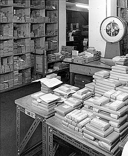
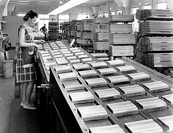
Producing foundry type was a very special profession: in the fifties, there were about a dozen typefoundries left in Europe. Their staff consisted of especially skilled and alert men and women. Their product — movable letters cast from a tin, antimony, and lead alloy (5 ½ , 28 ½ , 66 %) — had to be of highest precision (± 1/100 mm); otherwise some letters would not have neatly shown up on the printed sheet and caused extra work for printers. These are the individual steps by which letters are produced: the artwork is engraved on a brass plate, which serves as a pattern for the brass matrix. The engraved matrices are then justified to fit exactly in the casting machine. The typefounders operating the special casting machines produce the needed quantity of each letter. Every matrix has to be carefully adjusted in the correct position before the casting operation can begin. For small sizes like 6 pt etc., c. 2–300 pieces/min can be produced. For large ones (60, 72 pt), 20 pieces/min. Afterwards the cast types are distributed by the skilled Dividing Staff workers (usually women) 5.13 into so-called ‘founts’ 32 — packaged alphabets 5.11 including language-specific diacritics, numerals, and punctuation marks, which are ready to be stocked-up or sold right away. Foundry type is rather heavy: one font each of all sizes from 6 to 48 pt, equals some 140 kg per series. Punchcutters/engravers, typefounders, specialists as all other skilled professionals in the printing trade, had to pass a tough examination following a four-year-long apprenticeship. 33 5.12
5.11
Packaged founts
5.12
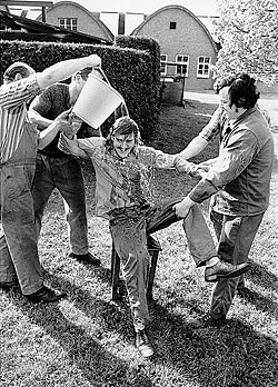
The very last founder apprentice after his 4-year apprenticeship “baptised” by his future colleagues in the factory’s garden. IVM Post (newspaper), 28 June 1974
5.13
Arranging all the cast letters in founts (sets)
Translation from German: Minima; translation from French: Polices
Hoffmann, Alfred
Whether or not a typeface turned out to be successful depended on different aspects. Sometimes, success was based on its cultural impact. Superba, for instance, was a well-selling typeface. It was particularly used for headlines in Swiss newspapers. Its bold weight, especially, was in high demand. 34 While some typefaces sold well on a national level, other typefaces were matching cultural tastes abroad. Typical display faces such as Graphique (1945) by Hermann Eidenbenz, Profile (1947) by Eugen and Max Lenz, and Bravo (1945) by Emil Alfred Neukomm, as well as Pro Arte (1955) and Horizontal (1965), both designed by Max Miedinger, were very popular. However, since these display faces could only be used sparingly for single words or headlines, their sales remained comparatively modest.
See also Rappo, ‘Twentieth-Century Type Design in Switzerland’, p. 277
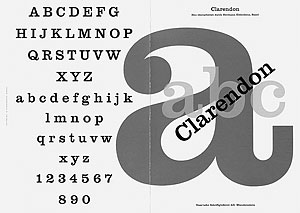
A big success was the Clarendon family (1953), created by Hermann Eidenbenz and referencing a model shown in a Haas mid-nineteenth century specimen book. 5.14 As soon as the first series was released onto the market, an overwhelming demand started. Haas became unable to meet all the requests on time. This reinterpretation started an international Clarendon wave similar to the situation a hundred years earlier, when the first Clarendon types had been released. As a consequence, other typefoundries released typefaces that looked similar to Clarendon. In a special agreement, Stempel added two additional weights to the Clarendon family to increase its versatility. Not only in the USA, but also in Germany it became a bestseller. 35

5.14
Type samples published in Aus der Geschichte der Haas’schen Schriftgießerei, undated
Hoffmann, Alfred
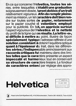
Still, the most popular creation of Haas is its sans serif series Helvetica, initially called Neue Haas Grotesk. The design conceived by Eduard Hoffmann and carried out by Max Miedinger 5.15 began in the year 1956. There was a need for new, contemporary sans serif typefaces. Particularly in Switzerland, typefaces like Erbar, Futura, Gill Sans, Neuzeit Grotesk, and Venus had lost popularity. The new favourites were Monotype Grotesque 215 and 216, and above all, Akzidenz‑Grotesk (Berthold) 36 — which was called Standard in the UK and the USA. This typeface became the default typeface of the ‘Neue Typographie’ era, and something of a norm in Swiss graphic design. 37 Haas began to suffer under this situation: its business shrunk. Therefore, in the mid-fifties, Eduard Hoffmann decided to create a new grotesk family, being well aware of the fact that it would severely compete with their own widely-used Normal‑Grotesk. 38 5.17 He commissioned Max Miedinger, a well-known capacity in the sans serif genre, to design a new grotesk to be based on Schelter‑Grotesk as the relevant model, which he [Hoffmann] traced from a former Haas specimen book. 39 A number of competent graphic designers were consulted, asked to comment on the first drawings, and to give their opinion on each single letter. Many of the forms had to be revised before an O.K. could be given. Particular attention was also paid to the general appearance of single word or text block samples. Gradually, the new series began to take shape.
5.15
Alfred Hoffmann and Max Miedinger during a conference at T.P.G exhibition, Paris, November 1967
5.16
Example of a newspaper ad series conceived by Walter Fisch, 1st proof before corrections, December 15, 1965, 213 × 298 mm
5.17
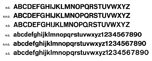
Comparison of 3 Sans Serifs: N.G. Normal‑Grotesk, N.H.G. Neue Haas Grotesk = Helvetica, A.G. Akzidenz‑Grotesk (Standard)
Bernd Feldmann, ‘Ein Schweizer Erzeugnis: Die Helvetica’, Typorama Journal, 22 (2007), p. 2
Hollis, pp. 44–5; see also Robin Kinross, Modern Typography: an Essay in Critical History (London: Hyphen Press, 1992), p. 129
Originally published by the matrix factory Wagner & Schmidt in Leipzig under the name Wotan, around 1914. Matrices of this typeface were purchased by several typefoundries in Europe, who gave Wotan their own names. At J. Wagner, it was called Edel Grotesk; at Nebiolo, Cairoli; Haas called it Akzidenz‑Grotesk. Coincidentally, this was the same name as the famous sans serif face from Berthold, which had nothing in common with the Haas design from Wagner & Schmidt. Haas’ Akzidenz‑Grotesk was available in light, medium, bold, and extra bold. After demands from many relevant customers for an intermediate weight between light and medium, Haas produced a new series of regular-weight fonts. They named this addition Normal‑Grotesk (without the word “Akzidenz” in the name). Normal‑Grotesk was an overwhelming success; even Linotype agreed to produce matrices for their composing machines. Because of the positive reactions, Haas revised their whole Akzidenz‑Grotesk/Normal‑Grotesk family — including one italic and three wide styles — which consisted of nine series. They took the opportunity to improve the designs for specific letters, particularly to eliminate any art‑nouveau‑style elements. The whole family was then rebaptised Normal‑Grotesk, to avoid unnecessary confusion with Berthold’s Akzidenz‑Grotesk. For a long period, it was the foundry’s bread-and-butter, so to speak. Personal Written Correspondence (11 January 2016); Hoffmann, Alfred
Hoffmann, Alfred
During this time, in Switzerland, it was Walter Fisch, 5.16 Haas travelling salesman and typeface expert, who in particular was actively promoting Helvetica to printing companies. Over the initial period of the first years selling Neue Haas Grotesk (NHG) in Switzerland proved hard and painstaking: indeed Emi Ruder, reputable professor at the Kunstgewerbeschule, Basel, and Rudolf Hostettler, esteemed editor of the TM Typografische Monatsblätter, indulged in promoting the rival typeface Univers by a persistent aggressive (often successful) action; any existence of NHG intentionally neglected. Gradually however, sales of NHG started to grow, especially also to countries abroad, 40 and before soon Haas proved unable to meet the steadily growing demand. At the very moment when Stempel was facing an economic down period with the risk of the business being wound up, Haas offered a welcome present in asking to cast part of its NHG programme in licence at their premises in Frankfurt am Main. Gradually, Stempel produced more Helvetica than the entire production of Haas, which included Helvetica and the rest of the integral programme. 41
Ibid.
Ibid.
Despite the general decline of the typefounders business, the sales of Helvetica developed sensationally worldwide. Alfred Hoffmann claims that Erich Schulz-Anker, the artistic director at Stempel, was largely responsible for the success of Helvetica in Germany by promoting the typeface extensively. Heinz Eul, a salesman at Stempel in Frankfurt am Main, was consulting printing offices, type shops, graphic design and advertising agencies. In the USA, Mike Parker, manager of type design of Mergenthaler Linotype Ltd., had recognised the success potential of Helvetica and pushed it strongly. 42
Ibid. From a spontaneous conversation with a Stempel employee
Neue Haas Grotesk’s release did happen at a period when other sans serif typefaces came on the market, a situation that played a role in its competitiveness. Univers was designed in 1953/1954 by Adrian Frutiger and originally developed at the Deberny & Peignot foundry in Paris for their Lumitype photocomposing machine. Later on in 1958 it was produced as traditional foundry type by Deberny & Peignot. 43 Univers was presented at the same time as Neue Haas Grotesk, in 1957, at the printing fair graphic 57 in Lausanne — without knowing of each other. 44 Both, Neue Haas Grotesk (later Helvetica) and Univers, were competitive typefaces. Robin Kinross compares Helvetica to a workhorse and Univers to a race horse, in terms of use. 45 Univers stood out with its 21 styles; it was therefore more versatile. The use of sans serifs was sometimes based on location and designers. While designers from Zurich used Akzidenz‑Grotesk and Helvetica, Basel’s designers were fond of Univers. Of course, there were exceptions, for example Wolfgang Weingart, also professor at the Allgemeine Schule für Gestaltung Basel, favoured Berthold’s Akzidenz‑Grotesk. 46 There were several other sans serif typefaces released almost at the same moment. These include Folio (Bauer Foundry, 1957), Mercator (Lettergieterij Amsterdam, c. 1958), Linea (Cooperativa Foundry, 1966), Recta and Forma (Nebiolo Foundry, 1958, 1966), and Permanent (Ludwig & Mayer Foundry, 1962). 47
Adrian Frutiger; Heidrun Osterer; Schweizerische Stiftung Schrift und Typographie, Adrian Frutiger, Schriften: das Gesamtwerk (Basel, Boston, Berlin: Birkhäuser, 2009), p. 96 and p. 109
Erich Alb, Personal Written Correspondence (30 September 2015); Hoffmann, Alfred
Robin Kinross, Modern Typography: an Essay in Critical History (London: Hyphen Press, 1992), p. 131
Hollis, p. 201; see also Kinross, p. 129
Jaspert et al, p. 274–5, pp. 304–5, p. 301, p. 320, pp. 326–8; Hoffmann, Alfred
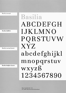
In the succeeding era of phototypesetting, Haas continued to design new typefaces, with a view to licensing them to manufacturers of phototypesetting equipment. In the early seventies, Haas commissioned André Gürtler, teacher at the Allgemeine Schule für Gestaltung, Basel, to design Basilia, 5.18 an interesting amalgamation of Didones, similar to Bodoni. It was in 1977 when Team’77 — Christian Mengelt, also teacher at the school, André Gürtler, and Erich Gschwind — was commissioned to design a new sans serif type similar to Helvetica. Since Linotype prevented Haas from signing licence agreements with any of its competitors, the foundry felt compelled to create a new version of Helvetica to comply with the desires urgently voiced by a great number of important companies willing to buy licences. The family was baptised Haas Unica (the name is a portmanteau word of Univers and Helvetica). 48
5.18
Basilia typeface, type & specimen design: André Gürtler, Basel, 1978, 210 × 297 mm
See also Rappo, ‘Twentieth-Century Type Design in Switzerland’, p. 278; see in issue A: Louise Paradis, ‘The Race for Unica’, pp. 34–7
In the eighties, collaborations took place with Italian type designer Aldo Novarese, who designed several typefaces for Haas such as ITC Novarese, Basilar, Expert, Evidens, Floreal, and Sport. 49 Among these six series only ITC Novarese and Expert have finally been produced. 50 Besides the design and production of typefaces, many other tasks were necessary to run a traditional typefoundry.
5.19
Weekend in Ticino, 1978 from left to right (top) Gaston Wicki, West-Switzerland salesman, Alfred Hoffmann, director, Roswitha Jung, executive secretary, Clärli Wicki, G. W.’s wife, Martin Fehle, external expert and delegate of the board (bottom) Walter Fruttiger, vice-director, Leo Kappeler, works manager
Rappo, ‘Twentieth-Century Type Design in Switzerland’, p. 278
Hoffmann, Alfred
Fields of Businesses indirectly related to Type
One of these fields was the sale of typefaces that were not designed by Haas. In the late sixties, a famous typeface family gained in popularity all over the Western world: Times. Walter Fisch first registered the growing demand of Times, voiced by his customers. Eduard Hoffmann particularly disliked this typeface. Thanks to his persistence, Fisch succeeded in convincing him to approve the idea of casting Times. Later, a licence agreement was signed with Monotype in the UK, and matrices were bought for roman, italic and demi-bold, as well as the roman series with the newer, lighter capitals. From there, fresh matrices were made and used for casting foundry type founts in all sizes from 6 to 72 pt in all three weights. Times proved to become a new hot seller. 51
Hoffmann, Alfred
Additionally, sales and marketing of the typefaces to potential clients were a significant undertaking. The foundry’s customers were virtually all 1700 Swiss printing offices, which were equipped for hand composition and relied on its services. For the personal contact with customers for Western or Eastern Switzerland, Haas employed two travelling salesmen. They advised printers competently on the purchase of typefoundry products and took their orders. On the occasion of this, during some visits in the year, they often learned about the trend of new typefaces or anything else that was moving in the industry. Thus, they could repeatedly supply useful advice to the foundry. 52 Promotion and sales were not restricted to national customers, but happened on an international market. 53 Participation in trade fairs was a good possibility to get in contact with potential clients. Type specimens 5.20 helped to present and promote the typefaces to customers, but also to graphic design students, the future clients.
5.20
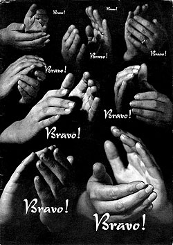
Bravo! typeface, type & specimen design: E. A. Neukomm, Zurich, 1946, 210 × 297 mm (w/leporello insert 837 × 297 mm (open))
5.21
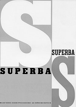
Superba type design: Edmund Thiele (in‑house), 1934 specimen design: Max Miedinger, Zurich, 1952 cover, 210 × 297 mm
Third of three main Superba specimens: the first designed by Numa Rick, 1934, the second by Donald Brun, 1942
5.22
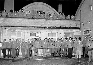
ATypI working seminar 1979. One week in the School of Arts and Crafts, to finish off the event trip to (Gartenstadt) Münchenstein by tram, continued on foot into the interior of Haas’ plant. All received the blue ‘Chutteli’ (to keep) with music, dance, large buffet and discussions in all rooms of the factory.
Ibid.
See also Wanner et al, p. 19
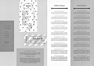
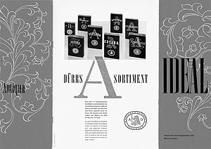
Eduard Hoffmann had a liking for carefully, often colourfully designed type specimens, which were able to present the typefaces convincingly in a variety of examples of use. For their execution, he alternately commissioned different, partly very renowned graphic designers. There were Rolf Rappaz, who designed the Commercial Grotesk specimen 54 in 1940 or Fritz Bühler, the Caslon Antiqua (1940) specimen 5.23 in 1945. An outstanding design, that of the Ideal Antiqua specimen 5.24 was probably designed by Walter Bangerter printed by City-Druck AG, Zurich. Besides that, it was not uncommon for type designers to create their own advertising. Walter Diethelm designed two Diethelm Antiqua specimens 5.25, and Edmund Thiele the specimen for Nürnberger Schwabacher 5.26 in 1935.
5.23
Caslon Antiqua & Kursiv type design: Edmund Thiele (in‑house), 1940, specimen design: Fritz Bühler SWB, Basel, 1945, 210 × 297 mm
5.24
Ideal Antiqua type design: in‑house, 1941, specimen design: City-Druck AG, Zurich, 1949, 210 × 297 mm (folded), 420 × 297 mm (open)
5.25
Diethelm Antiqua type & specimen design: Walter Diethelm, Zumikon, 1957, 210 × 297 mm (wiro binding)
5.26
Nürnberger Schwabacher type design: Edmund Thiele (in‑house), 1927, 213 × 310 mm (au fil binding)
5.27
Superba type design: Edmund Thiele (in‑house), 1934, specimen design: Max Miedinger, Zurich, 1952, 210 × 297 mm
5.28
Graphique type & specimen design: Max Miedinger, Zurich, 1957, 210 × 297 mm
Later integrated into the Helvetica family as semi bold condensed (schmalhalbfett), bold condensed (schmalfett), compact (bold with tight side bearings); Hoffmann, Alfred.
Typeface licensing was another activity beginning with the late fifties, managed by Alfred Hoffmann. Increasingly, many type producers requested alphabet templates of an important range of Haas typefaces for their business. Haas delivered reproduction proofs of the complete alphabet with caps and lower case, numerals and punctuation marks to various areas beyond hot-metal typesetting, mainly for producers of photo titling machines but also for manufacturers of punched and self-adhesive letters for the labelling of façades, shop windows, trucks; lettering systems of all kinds, transfer sheets such as Letraset, etc. In 1980 Haas had 50 licencees who produced its typefaces: small businesses up to huge international computer companies. 55
Wanner et al, p. 19; Hoffmann, Alfred
With a substantial number of typefaces and typeface families such as Helvetica, Univers, Clarendon and the big range of display faces, licensing had become an economically interesting business. Furthermore, Haas provided a type sheet service for graphic artists and printers, which was popular in the times before the photocopy machine in the sixties. It consisted of loose sheets with dummy text set in the desired typeface and in all type sizes — set solid, one point and two points leaded — which later was cut into the right sizes to generate mock-ups. 56 The advent of photocopiers some years later made this rather expensive concept obsolete.
Hoffmann, Alfred
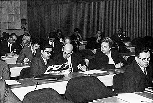
Networking and voluntary engagement has always been important for the company’s management. Alfred Hoffmann reports that his father encouraged him to be part of all sorts of circles of acquaintances that were related to printing and typography. He would be part of meetings by block makers, printers, or a public relations club. The most important connection was doubtlessly the ATypI. 5.22 For three decades, he was part of its board. The association’s aim was, amongst others, the draft for a law to protect typefaces. This law was adopted in 1973, but unfortunately never ratified. 57 Charles Peignot from the French typefoundry Deberny & Peignot was the initiator of the idea of a general typeface protection, anticipating that typefaces were at risk of being copied without being licensed at a time when phototypesetting was about to break through. 58
Malsy, p. 23; see also Wanner et al, p. 15
Hoffmann, Alfred
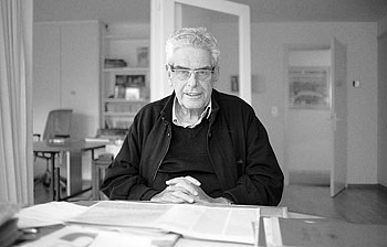
Today, Alfred Hoffmann 5.30 is still socially active at the Basler Papiermühle, the Swiss Museum for Paper, Type and Print, 59 which his father helped to set up. In 1980, together with the paper chemist and historian W. Fritz Tschudin and the historian Albert Bruckner, he initiated the Foundation Basler Papiermühle, which also contains a detailed document collection of the history of the Haas Typefoundry. 60
Malsy, p. 23
Ibid.
A Centuries-old Way of Producing Type
is merely History Today
We have seen Haas’s business development in light of its organisational background during a period of transition due to technological changes, as well as its activities such as typeface design and production and the other fields of business indirectly related to type. At the same time, we could notice the importance that the international market represented for the firm and how it contributed to its success.
When the once so important and successful foundry was closed, many professions related to typefounding disappeared, such as punchcutters, typecasters, etc. In the close sense of ‘a foundry is a factory that produces metal letters’ physically, today a typefoundry has not much to do with the original meaning, it simply borrows the traditional term. 61 The heavy hot-metal technology and the material in general has been replaced by mathematical data in the form of Bézier curves representing the immaterial. The scopes of applications from then to today have dramatically changed. While during Haas’ time type was used for hand-setting, for phototypesetting machines and several other applications, today ‘corporate typeface’ designs and ‘webfonts’ are the main focus. The challenges of a competitive font production and the global market, however, remain the same. 62
Some specify ‘Digital’ Type Foundry nowadays
See also Rappo, ‘Twentieth-Century Type Design in Switzerland’, p. 282
Producing type in the past and making type today is equally complex in terms of time and production. What has changed is merely how type is made, as well as the material components and the production process. As a consequence, such a business, operating with — today — outdated production methods, has become extinct — at least almost. There are still aficionados such as the Swiss ‘Typorama’ — a museum and production studio for hand typesetting and letterpress printing, situated in Bischofszell, in the Canton of Thurgau. The ‘Offizin Parnassia’, located in the mountain village Vättis in the Canton of St.-Gall, is casting, typesetting and printing today, just as in Gutenberg’s times. While in the fifties Haas was Switzerland’s only foundry of importance, today we can count quite a few internationally operating Swiss online typefoundries — even though they are rather small compared to global players, such as Monotype Inc.
It was a true accomplishment for Haas to be able to exist for over four centuries. 5.29 Part of its existence perhaps had to do with the technologies deployed, which followed a long tradition. 5.32 The mechanical hand typesetting technology has its roots in Gutenberg’s times, and survived in the machine hand-setting technology until the eighties using machines such as Monotype and Linotype. 63 It is difficult to imagine a stable company of this kind today — in our ephemeral and fast-moving world, where technologies change at a fast pace, and every decade seems to technologically replace the previous one.
5.29
400 years Haas Typefoundry logotype, Adrian Frutiger, 1980
5.30
Alfred Hoffmann at home (Bottmingen) in conversation with Brigitte Schuster, 17 January 2015
5.31
Clarendon type & specimen design: Hermann Eidenbenz, Basel, 1952, 210 × 297 mm (folded), 627 × 297 mm (open)
5.32
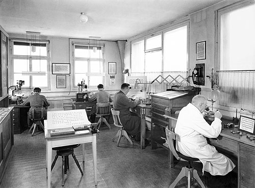
General view of the punchcutting studio, front Edmund Thiele c. 1951
Hoffmann, Alfred
As the title of Willi Mengel’s article suggests: ‘Die älteste Schriftgießerei der Welt’, in Linotype-Post (Berlin & Frankfurt/Main: Linotype GmbH), 34 (March 1957), pp. 6–9.
1740 was the year when Johann Wilhelm Haas took over the company, which had existed under different names since 1579.
Mengel, pp. 6–9; see also Albert Bruckner, Schweizer Stempelschneider und Schriftgiesser (Geschichte des Stempelschnittes und Schriftgusses in Basel und der übrigen Schweiz von ihren Anfängen bis zur Gegenwart), im Auftrag der Haas’schen Schriftgiesserei AG (Münchenstein, 1943), pp. 66–84
Mengel, pp. 6–9; see also Bruckner, pp. 84–129; see also Martin Kluge; Basler Papiermühle, Die Basler Papiermühle: schweizerisches Museum für Papier, Schrift und Druck (Basel: Basler Papiermühle, 2014), pp. 75–8
Under Krayer the logo representing a rabbit was designed by F.W. Kleukens, a German type designer.
Victor Malsy; Axel Langer; Indra Kupferschmid; Helvetica Forever. Geschichte einer Schrift (Baden/Switzerland: Lars Müller, 2008), p. 23; Alfred Hoffmann, Interviews and Conversations (17, 31 January 2015; 6 June 2015; 5, 21, 23 September 2015)
Martin Fehle (1925–2008) was a former President of ATypI. He was a long-standing member of the Board for Lindt & Sprüngli chocolate company in his home town Kilchberg/Zurich (Switzerland). Luc Devroye, Martin Fehle, Type Design Information Compiled and Maintained by Luc Devroye <http://luc.devroye.org/fonts-48782.html> [accessed 5 June 2015]; Hoffmann, Alfred
Hoffmann, Alfred
Malsy et al, p. 25
Hoffmann, Alfred
Ibid.
Ibid.
See also Fritz Antenen; Fritz Jaggi; Kirschgarten‑Druckerei, Typorama. Rund um das graphische Gewerbe (Basel: Kirschgarten‑Druckerei AG, cop. 1964), p. 149
Translation from German: Layoutsetzerei/en
Hoffmann, Alfred
Malsy et al, p. 23; Walter Fruttiger’s lead type is still available at schriftenservice-d-stempel.de
Gustav Adolf Wanner; Arnold Schneider; Paul Göttin; Haas’sche Schriftgiesserei, 400 Jahre Haas, 1580–1980 (Basel: Haas’sche Schriftgiesserei, 1980), pp. 4–5
François Rappo, ‘The Type Repertoire’, in 100 Years of Swiss Graphic Design, ed. by Christian Brändle; Museum für Gestaltung Zürich (Zurich: Lars Müller, 2014), p. 289; see also Bruckner, pp. 107–9
Wanner et al, pp. 5–6; see also Bruckner, p. 117; Wilhelm Haas, Das gebet des Herrn in 100 sprachen und mundarten (Basel: W. Haas, 1830)
see also Wanner et al, p. 8
Translation from German: “Erzeugnisse der Giesserei mag an der beim Schweizer allgemein beobachteten Nüchternheit liegen und seinem Sinn für das Bodenständige…”, Eduard, Hoffmann,‘Das Schriftschaffen der Haas’schen Schriftgiesserei, Münchenstein/Basel, seit dem Jahre 1924’, Typografische Monatsblätter, Schweizer Grafische Mitteilungen, 79 (1960), 4, pp. 217–20
Malsy et al, pp. 22–3
See also François Rappo, ‘Twentieth-Century Type Design in Switzerland’, in 100 Years of Swiss Graphic Design, ed. by Christian Brändle; Museum für Gestaltung Zürich (Zurich: Lars Müller, 2014), p. 277
Wanner et al, p. 16
Translation from German: Kunstgewerbeschule/n
Richard Hollis, Schweizer Grafik: die Entwicklung eines internationalen Stils: 1920–1965 (Basel, Boston, Berlin: Birkhäuser, 2006), p. 199
Hollis, p. 114
Jonas Niedermann, ‘Ernst Keller, Alfred Willimann and Walter Käch. Education in Writing and Lettering at the Kunstgewerbeschule Zurich in the First Half of the 20th Century’ (unpublished Master thesis, University of Reading, 2013), p. 54
See also Rappo, ‘The Type Repertoire’, p. 289
Ibid.
W. Pincus Jaspert; W. Turner Berry; A. F. Johnson, Encyclopaedia of Typefaces (London: Cassell Illustrated, 2008), p. 39
Translation from German: Minima; translation from French: Polices
Hoffmann, Alfred
See also Rappo, ‘Twentieth-Century Type Design in Switzerland’, p. 277
Hoffmann, Alfred
Bernd Feldmann, ‘Ein Schweizer Erzeugnis: Die Helvetica’, Typorama Journal, 22 (2007), p. 2
Hollis, pp. 44–5; see also Robin Kinross, Modern Typography: an Essay in Critical History (London: Hyphen Press, 1992), p. 129
Originally published by the matrix factory Wagner & Schmidt in Leipzig under the name Wotan, around 1914. Matrices of this typeface were purchased by several typefoundries in Europe, who gave Wotan their own names. At J. Wagner, it was called Edel Grotesk; at Nebiolo, Cairoli; Haas called it Akzidenz‑Grotesk. Coincidentally, this was the same name as the famous sans serif face from Berthold, which had nothing in common with the Haas design from Wagner & Schmidt. Haas’ Akzidenz‑Grotesk was available in light, medium, bold, and extra bold. After demands from many relevant customers for an intermediate weight between light and medium, Haas produced a new series of regular-weight fonts. They named this addition Normal‑Grotesk (without the word “Akzidenz” in the name). Normal‑Grotesk was an overwhelming success; even Linotype agreed to produce matrices for their composing machines. Because of the positive reactions, Haas revised their whole Akzidenz‑Grotesk/Normal‑Grotesk family — including one italic and three wide styles — which consisted of nine series. They took the opportunity to improve the designs for specific letters, particularly to eliminate any art-nouveau-style elements. The whole family was then rebaptised Normal‑Grotesk, to avoid unnecessary confusion with Berthold’s Akzidenz‑Grotesk. For a long period, it was the foundry’s bread-and-butter, so to speak. Personal Written Correspondence (11 January 2016); Hoffmann, Alfred
Hoffmann, Alfred
Ibid.
Ibid.
Ibid. From a spontaneous conversation with a Stempel employee
Adrian Frutiger; Heidrun Osterer; Schweizerische Stiftung Schrift und Typographie, Adrian Frutiger, Schriften: das Gesamtwerk (Basel, Boston, Berlin: Birkhäuser, 2009), p. 96 and p. 109
Erich Alb, Personal Written Correspondence (30 September 2015); Hoffmann, Alfred
Robin Kinross, Modern Typography: an Essay in Critical History (London: Hyphen Press, 1992), p. 131
Hollis, p. 201; see also Kinross, p. 129
Jaspert et al, p. 274–5, pp. 304–5, p. 301, p. 320, pp. 326–8; Hoffmann, Alfred
See also Rappo, ‘Twentieth-Century Type Design in Switzerland’, p. 278; see in issue A: Louise Paradis, ‘The Race for Unica’, pp. 34–7
Rappo, ‘Twentieth-Century Type Design in Switzerland’, p. 278
Hoffmann, Alfred
Hoffmann, Alfred
Ibid.
See also Wanner et al, p. 19
Later integrated into the Helvetica family as semi bold condensed (schmalhalbfett), bold condensed (schmalfett), compact (bold with tight side bearings); Hoffmann, Alfred.
Wanner et al, p. 19; Hoffmann, Alfred
Hoffmann, Alfred
Malsy, p. 23; see also Wanner et al, p. 15
Hoffmann, Alfred
Malsy, p. 23
Ibid.
Some specify ‘Digital’ Type Foundry nowadays
See also Rappo, ‘Twentieth-Century Type Design in Switzerland’, p. 282
Hoffmann, Alfred
biographies
Erich Alb, born 1945 in Zurich, apprenticed as a typesetter and Monotype keyboard operator. After two years of further studies in typography and type design at the AGS school Basel he worked many years as a book designer and finally formed the publishing company Syndor Press, publishing books for Adrian Frutiger and Hans Eduard Meier, who have been his close friends during a long time. Alb is a long-standing member of ATypI.
Alfred Hoffmann was born 1927 in Basel. In 1968 he became the director of the Haas Typefoundry. He was responsible for the sales of lead typefaces and their marketing. He took care of the worldwide licensing. He retired in 1989, the year of the company’s official closing.
Brigitte Schuster, born 1976 in Amberg/Germany, is a graphic designer, specialising in typography and type, as well as a writer and teacher. In 2013, she set up her own publishing house, ‘Brigitte Schuster Éditeur’. She currently lives and works in Bern, Switzerland. brigitteschuster.com
acknowledgements
I am thankful to Alfred Hoffmann. A large part of the information in this paper has been collected during several visits at his home and during phone conversations. He represents a living testimonial, talking about history with lively and worthwhile stories from his own experience, of the period of activity of the Haas Typefoundry in the second half of the twentieth century. He was most helpful in providing me with detailed information about the company as well as with archival material and, of course, by sharing his time. Alfred Hoffmann is concerned that some of the information he provided might include human errors. He therefore suggests reading it ‘cum grano salis’ (translation from Latin: with a grain of salt). Furthermore, I am thankful to Erich Alb who provided a final proofreading. Due to his experience with 50 years of typography and type he improved the content with corrections and additions.
bibliography
Alb, Erich, Personal Written Correspondence (30 September 2015)
Antenen, Fritz; Fritz Jaggi; Kirschgarten-Druckerei, Typorama. Rund um das graphische Gewerbe (Basel: Kirschgarten-Druckerei AG, cop. 1964)
Bruckner, Albert, Schweizer Stempelschneider und Schriftgiesser (Geschichte des Stempelschnittes und Schriftgusses in Basel und der übrigen Schweiz von ihren Anfängen bis zur Gegenwart), im Auftrag der Haas’schen Schriftgiesserei A.G. (Münchenstein, 1943)
Devroye, Luc, Martin Fehle, Type Design Information Compiled and Maintained by Luc Devroye <http://luc.devroye.org/fonts-48782.html> [accessed 5 June 2015]
Feldmann, Bernd, ‘Ein Schweizer Erzeugnis: Die Helvetica’, Typorama Journal, 22 (2007), p. 2
Frutiger, Adrian; Heidrun Osterer; Schweizerische Stiftung Schrift und Typographie, Adrian Frutiger, Schriften: das Gesamtwerk (Basel, Boston, Berlin: Birkhäuser, 2009)
Haas, Wilhelm, Das gebet des Herrn in 100 sprachen und mundarten (Basel: W. Haas, 1830)
Hoffmann, Alfred, Interviews and Conversations (17 January 2015, 31 January 2015, 6 June 2015, 5 September 2015, 21 September 2015, 23 September 2015)
Hoffmann, Eduard, ‘Das Schriftschaffen der Haas’schen Schriftgiesserei, Münchenstein/Basel, seit dem Jahre 1924’, Typografische Monatsblätter, Schweizer grafische Mitteilungen, 79 (1960), 4, pp. 217–20
Hollis, Richard, Schweizer Grafik: die Entwicklung eines internationalen Stils: 1920–1965 (Basel, Boston, Berlin: Birkhäuser, 2006)
Jaspert, W. Pincus; W. Turner Berry; A. F. Johnson, Encyclopaedia of Typefaces (London: Cassell Illustrated, 2008)
Kinross, Robin, Modern Typography: an Essay in Critical History (London: Hyphen Press, 1992)
Kluge, Martin; Basler Papiermühle, Die Basler Papiermühle: schweizerisches Museum für Papier, Schrift und Druck (Basel: Basler Papiermühle, 2014)
Malsy, Victor; Axel Langer; Indra Kupferschmid; Helvetica Forever. Geschichte einer Schrift (Baden/Switzerland: Lars Müller, 2008)
Mengel, Willi, ‘Die älteste Schriftgießerei der Welt’, in Linotype‑Post (Berlin & Frankfurt/Main: Linotype GmbH, March 1957), 34, pp. 6–9
Niedermann, Jonas, ‘Ernst Keller, Alfred Willimann and Walter Käch. Education in Writing and Lettering at the Kunstgewerbeschule Zurich in the First Half of the 20th Century’ (unpublished Master thesis, University of Reading, 2013)
Paradis, Louise, ‘The Race for Unica. One-off Two: Unica Intermediate’, in Footnotes, issue A (Geneva: La Police, 2016), pp. 34–7
Rappo, François, ‘Twentieth-Century Type Design in Switzerland’, in 100 Years of Swiss Graphic Design, ed. by Christian Brändle; Museum für Gestaltung Zürich (Zurich: Lars Müller, 2014), pp. 274–83
Rappo, François, ‘The Type Repertoire’, in 100 Years of Swiss Graphic Design, ed. by Christian Brändle; Museum für Gestaltung Zürich (Zurich: Lars Müller, 2014), pp. 288–9
Wanner, Gustav Adolf; Arnold Schneider; Paul Göttin; Haas’sche Schriftgiesserei, 400 Jahre Haas, 1580–1980 (Basel: Haas’sche Schriftgiesserei, 1980)
sightings
Basler Papiermühle
St. Alban-Tal 37, 4052 Basel
editing & proofreading
Alfred Hoffmann, Dan Reynolds
iconography credits
all documents courtesy of Alfred Hoffmann/Basler Papiermühle, all scans in‑house except 5.30
5.1 photographer unknown
5.2 Foto Atelier Eidenbenz, Basel
5.4 Foto Kuno Mathis, Binningen
5.5 photographer unknown
5.6 Ibid.
5.7 Foto Hans Keusen, Bern
5.8 Foto Atelier Eidenbenz, Basel
5.9 Foto Hans Keusen, Bern
5.10 Spreng SWB Basel
5.11 Foto Hans Keusen, Bern
5.12 P. Armbruster, Basel
5.13 Heiner Grieder, Langenbruck
5.15 private snapshot
5.19 photographer unknown
5.22 photographer unknown
5.30 Brigitte Schuster
5.32 Schwitter A.‑G. Basel, Zurich
online version info
Originally published in issue A (part 1) 2016, concluded in issue B (part 2) 2017.