4
The Race for Unica
One-off Two: Unica Intermediate

4.1
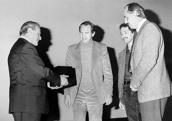
“L. Moyroud, inventor of phototypesetting and adviser of Bobst Graphic, remitting the distinction «La Lettre d’Or 1978» to Team’77” (André Gürtler, Erich Gschwind, Christian Mengelt), Lausanne
In 2007, I took a type design class as part of the evening programme of the Art Center College of Design, in Pasadena. I was working as a graphic designer for American Apparel in Los Angeles at the time, and Helvetica was (and still is) a key element of the brand identity, so I was using this typeface every day at work. I don’t remember many details from the type design class, but I recall clearly that one evening the lecturer showed us a photocopy of a font project called Haas Unica. It raised an immediate interest since this typeface is linked with Helvetica.
Our tutor Hrant Papazian told us that in 1977, the Haas Typefoundry, of Basel, commissioned three designers — Erich Gschwind, André Gürtler and Christian Mengelt — known as Team’77, to rework Helvetica as a sans serif for new photocomposition systems, which was by then 20 years old. They put together a proposal for possible changes to its form and for optical and rhythmical corrections to the typeface. It led finally to the creation of a brand new typeface, Haas Unica, which was launched onto the market in 1980. Some members of Team’77 had previously worked with the creator of Univers, Adrian Frutiger, and while the team researched Helvetica, Univers was a principal reference. Indeed, Haas Unica appears to be in a certain sense a balanced amalgam of Helvetica and Univers. Following the sale of the Haas Typefoundry in 1989, Haas Unica was withdrawn from the market and its rights lay in a nebulous state. As a result, the typeface has reached an almost mythical status among designers internationally. Many recent type design projects have proved its lasting influence; it could even be said to be enjoying a ‘revival’ of sorts, with the remarkable drawing and proportions of Haas Unica serving as references for new typefaces.
Years later, in 2009, I enrolled on the Art Direction Master’s programme at ECAL, in Lausanne, Switzerland. In my first year on the course I was able to deepen my basic knowledge of type design and started a couple of projects on the subject. I worked on a revival of Recta, 1 for which I also spent some six weeks doing a summer internship at Font Bureau. However, I more or less put these type projects on hold in order to concentrate fully on my final project.
My thesis took the form of a historical research about Typografische Monatsblätter (or TM), a Swiss typographic journal founded in 1933. It has been a forum for many discussions and ideas, and was one of the most important journals to successfully disseminate the phenomenon of Swiss typography to an international audience, as well as spreading the burgeoning ideas of the New Wave style. The first and foremost aim of TM was to foster a synergy between designers and the printing trades in the fields of industrial and commercial communication in Switzerland.
Aldo Novarese, Nebiolo typefoundry, Turin, Italy, 1958
I decided to focus on 30 years of TM, from 1960 to 1990, because of two main factors: the changes in graphics, and the evolution of technology from lead type to computer. One of the focuses of my research were the covers of the journal, as they were a prominent and striking aspect of the publication, and provide an overview of the attitudes and aesthetics concerns of the period. I started to identify the typefaces used in each cover, and not one used Neue Haas Grotesk, known as Helvetica, which I had formerly considered to be the quintessential typeface of Swiss typography. Instead the dominant typeface was Univers, which is featured for over twenty years, starting with the 1961 series of covers by Emil Ruder — a pivotal moment in Swiss typography. These covers also marked the end of the golden years of lead typography, as by then the integration of photocomposition was beginning.
This simple discovery led to a new understanding: Swiss typography was never a unified, consensual trend. In fact, it can be divided into separate factions, Zurich and Basel, each endorsing different typefaces. Both Univers and Neue Haas Grotesk were released in 1957. For the supporters of Emil Ruder and the Schule für Gestaltung Basel, Neue Haas Grotesk appeared flat compared to the refined and elegant Univers. On their side, the leading designers in Zurich — who considered Univers to be overly smooth and formalistic — were charmed by the solid and restrained Neue Haas Grotesk.
During my research, I came across an article about Haas Unica in issue 4 of TM of 1980: the original of which my tutor in Pasadena had shown a photocopy. The article was part of a special issue celebrating 400 years of the Haas Typefoundry, and announcing the newly finished typeface Haas Unica. It thus became evident to me that I would use Unica as the typeface of my thesis: it represented the perfect alternative for a project discussing the history of Swiss typography and graphic design. Using Helvetica or Univers seemed too political, as each represented a specific region and group of designers. Another factor was that Unica had been designed especially for photocomposition, and technology was an important topic in my research. It displayed not only qualities and characteristics from the most important Swiss mid-century sans serif typefaces but also featured a particular drawing characteristic relevant to photocomposition — ink traps were intentionally created and skilfully handled.
My tutor François Rappo had purchased the Unica version of Scangraphic when it was still available on the market, and he agreed to let me use the typeface for this specific project. 2 I started to make layout tests. Four weights had been created (Light, Regular, Medium and Bold), but I soon realised that I was unhappy with them all. I wanted to use only one weight (which refers to Swiss typography style) throughout my entire thesis, but the regular cut seemed too light and the medium too bold.
Having purchased Unica when it was still available on the market, it was legitimate for François Rappo, as head of the TM research project, to use Unica. However, since I had produced an intermediate version, using it without the consent of Team’77 and/or Christian Mengelt, would have been, strictly speaking, illegal practice.
I decided to create a weight in-between the regular and medium, to see how it would look. Using the blend tool in FontLab, a median version was produced, and even if a lot of letters came out in the wrong shape, it gave me a good idea of what it could look like. I tried different percentages of implementation and found a weight that I liked, which was pretty much in the middle — an ‘intermediate’ weight.
When I presented the first results to Rappo he immediately showed me the work of Cornel Windlin for the grand theatre Schauspielhaus Zürich in 2009, for which a customised version of Unica was created. Yet, although by no means did I want to step on someone’s toes, it was clear to me that the intermediate version I was working on was the best option for layout. I therefore decided to fix the blended version with help and guidance from François Rappo.
After I graduated, Rappo proposed developing the TM project further by turning it into a research project funded and supported by the HES-SO and ECAL. I thought it would be interesting if this new official research project would take the form of an archive website and book which would complement each other. By August 2012 the website was ready to be launched. The only question was whether or not to use the Unica intermediate weight for the website. It was no longer a classroom project, and I was aware that what I had done was not strictly legal. Yet at the same time Unica was, again, the perfect typeface for the project.
When looking into the matter, I discovered that the seemingly nebulous rights for Haas Unica were held by Linotype. On requesting permission from the company to use my version for this project, only their reply stated that the typeface was not in their catalogue and therefore my request did not relate to them. I next contacted the original designers, Team’77, and Christian Mengelt not only gave me his blessing to use the intermediate typeface but also sent me comments on how to improve this version: “After 35 years, I regard Unica in a more critical and analytical way. I would probably do something a little different today. I would revise the contrast between vertical and horizontal strokes of individual letters. Some examples: the ‘H’ is good, the ‘O’ and ‘S’ are too uniform in stroke thickness. The same goes for the stroke contrast between the stressed and unstressed diagonals, e.g. the first vertical of the ‘M’ is too thick compared to the second diagonal; in the ‘N’ the two verticals are too thick compared to the diagonal — they should not be much thinner, but the difference should be clearer, more following the rhythmic principle of Antiqua. Also, I would review the design of some individual forms. Some examples: the top curve of the letter ‘a’ is too heavy on the left, and too light on the right. The letter ‘e’ is generally rather too wide. On the letter ‘R’ the transition of the upper horizontal line in the bow is not smooth — the arch drops. The revision of letter spacing would also need some careful attention, especially in the italic version.”

4.2
Through a slight narrowing of the lower half and a displacement of the diagonal, it has been possible to make the form more fluent and compact. (The capital S needed the same corrections as the lower case letter.)

4.3
The alternating rhythm of heavy and light has also been taken into account in M, N, V, W, X, Y. The widening of the M produces rather larger counter spaces and reduces the stress in the junctions.

4.4
By using the same heavy-light rhythm, the verticals have been made rather lighter and the diagonals rather heavier, giving a more balanced effect to the form.

4.5
The upper curve has been made distinctly rounder. A subtle outward sweep in the verticals allows the application of this detail to all bold and condensed series.

4.6
As with B, E, F, P, the R has been made more condensed. The revision of the diagonal running out from the curve gives the form a more dynamic effect.
Hence, with the help of an assistant who created a web version, the TM project appeared online (tm-research-archive.ch) on September 2012 in Unica intermediate, and the typeface was also used for the book 30 Years of Swiss Typographic Discourse in the Typographische Monatsblätter, launched in October 2013.
Unica intermediate was motivated by a real graphic design need, and was by no means a ‘puristic’ revival. While one could criticise my nerve in having used it without clearing rights officially, my efforts seem to have been part of a series of events which triggered further interest and developments with regard to the typeface. For soon several Unica revivals were underway — with different parties in the running. In one example, Monotype launched Neue Unica in May 2013, albeit with only the one ultra light weight available at the time. This highlights a common aspect of type revival projects, which can often be seen as a race to obtain rights and launch the type onto the market in advance of any competitors. In the meantime, in February 2015 Lineto launched Unica77, a four-weight Unica revival, developed in close collaboration with one of its original designers, Christian Mengelt. Mengelt is a type design authority and has been involved in many important projects, such as Gerstner-Programm, the redrawing of Akzidenz-Grotesk for Karl Gerstner, and has also designed numerous typefaces, including Sinova in 2010 and Basel Antiqua in 2014. Needless to say, having one of the original creators revisiting Unica some thirty years later is both fascinating and extremely valuable. Having been unavailable for more than two decades Unica is now back on the market in two different versions: Unica77™ (the only legitimate digital one) and Neue Haas Unica™ — a fact certain to delight graphic designers the world over.

4.7
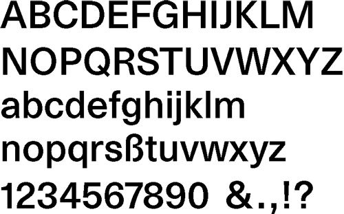
Unica intermediate, 20 pt
Aldo Novarese, Nebiolo typefoundry, Turin, Italy, 1958
Having purchased Unica when it was still available on the market, it was legitimate for François Rappo, as head of the TM research project, to use Unica. However, since I had produced an intermediate version, using it without the consent of Team’77 and/or Christian Mengelt, would have been, strictly speaking, illegal practice.
context
30 Years of Swiss Typographic Discourse in the Typografische Monatsblätter
Edited by Ecole cantonale d’art de Lausanne (ECAL), Louise Paradis with Roland Früh and François Rappo
21.5 × 31.5 cm, 276 pp., 472 ill., hardcover (2013)
ISBN 978-3-03778-334-4, English
Published by Lars Müller Publishers, 2013, design with Robert Huber
biographies
Louise Paradis (*1980) is a freelance art director and lecturer based in Los Angeles. She received a BA in graphic design from UQAM, Canada (2003), and an MA in Art Direction from ECAL, Switzerland (2011).
Team’77 is a group of type design specialists (André Gürtler (1936–2021), Christian Mengelt (*1938), Erich Gschwind (*1947)) involved in letterform research and design.
acknowledgements
Many thanks to Christian Mengelt, Ariella Yedgar, Michel Davitti and Roland Früh
further reading & sightings
“From Helvetica to Haas Unica”, Team’77, Typografische Monatsblätter, 4, 1980
“Basle and the Printer’s Craft, from the Middle Ages to the Present Days”, Arnold Schneider (part of the box published by the Haas Typefoundry Ltd. on the occasion of its 400th anniversary, Basle 1980.) According to this mention: “For the printing of this address the new photo typeface ‘Haas Unica’, created by Team ’77, Basle, for the Haas Typefoundry Ltd., was used for the first time.”
iconography credits
4.1 Sammlung Hostettler, Zentrum für das Buch, Kantonsbibliothek St. Gallen
4.2-6 Excerpts from “From Helvetica to Haas Unica”, Team’77, Typografische Monatsblätter, 4, 1980, courtesy of Lukas Hartmann
iconotrack
Lukas Hartmann (TM), Roger Chatelain, Claude-Michel Jacot, Luciano Antonietti, Eric Schopfer, Christian Mengelt, Michel Davitti & Ernest Imhof (BG), Cornel Windlin, Roland Früh
online version info
Originally published in issue A, 2016.